PUBLISHED ON — February 2026
Redesign Breast Simulator
Overview
The 3D cosmetic surgery simulation software allows, on the one hand, the surgeon to perform a simulation of a surgery very close to reality, and on the other hand, it allows the patient to see very closely what their surgery would look like. All this is done through the process of converting 2D images into 3D.
The objectives focus on enhancing the user experience and efficiency of the simulator.
Clarify the hierarchy and grouping of simulator components,
rectify inconsistencies, and improve the intuitiveness of ‘curves’ and other elements.
Furthermore, we aim to upgrade the Estetix communication environment to better assist doctors in managing patient communications.
Role
Date
Challenge Overview
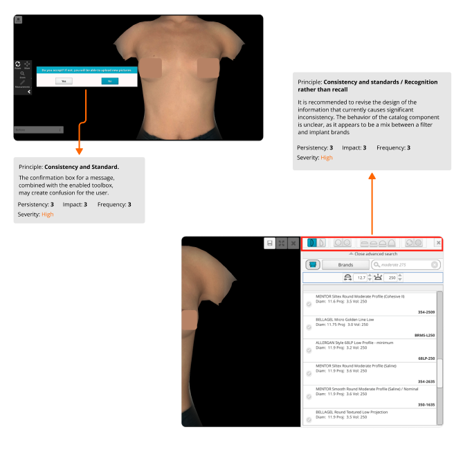
There was a notable lack of hierarchy and grouping of components in the simulator. Some components exhibit inconsistencies, such as the dual option to adjust
breast volume and diameter. The same component also exists when the catalog is opened, leading to unnecessary duplication and functional inconsistencies
that could be improved.
Another inconsistency lies in the ‘curves’ component. Its operation is unclear and requires quick ideation processes to enhance its usability.
Furthermore, the communication environment established in Estetix, meant to facilitate a doctor’s daily communication with patients, lacks consistency
and isn’t providing adequate assistance. The communication strategy between patient and doctor needs a thorough review.
Design Challenges
Some Hypothesis
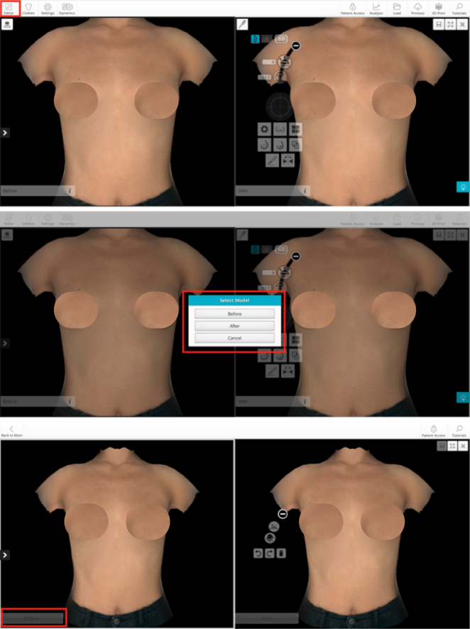
The doctor may not see the tools when accessing the simulator.
It is possible that the doctor does not know some of the tools as he does not have any visual reference related to standard or literal iconography to help him.
The process to edit any of the simulations, before or after, is not clear, once the edit button is clicked and the simulation is selected, it is not understood what the next step is.
Discovery & Problem Framing
Getting familiar with the UI
With the objective of getting to know the product’s user at a general level and identifying their main needs and problems, inquiry tests were conducted with the Sales Department, Customer Success, and the product’s CEO. Subsequently, all the feedback was validated with clients who would participate in interviews from different countries.
Steps of the research
- Interviews with internal stakeholders and surgeons
- I conducted a heuristic analysis to list the usability issues
- I implemented a card sorting exercise to organize the simulator’s content.
- I analyzed the quantitative data from the company’s analytics and CRM
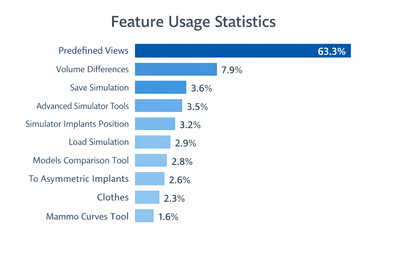
Heuristic Analysis results
These were the most used for breast simulation:
A heuristic study was conducted for the Breast functionality, following the principles results established by Jakob Nielsen in 1994.
- Hypotheses found with High severity: 12
- Hypotheses found with Medium severity: 2
- Hypotheses found with Low severity: 0
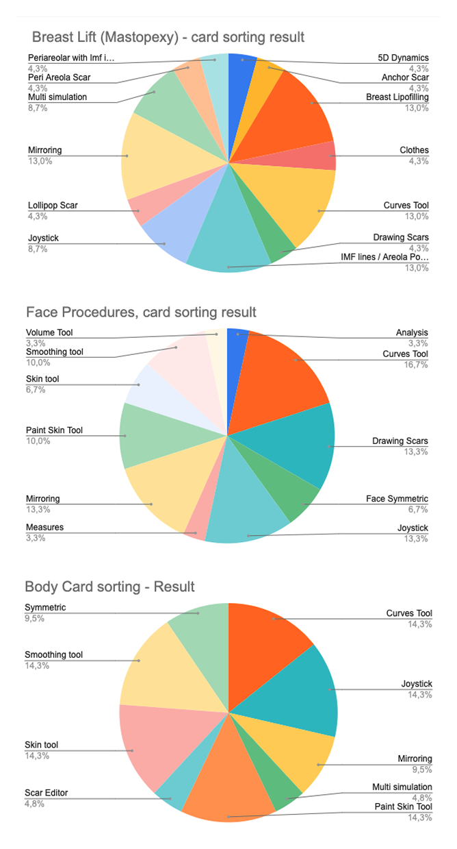
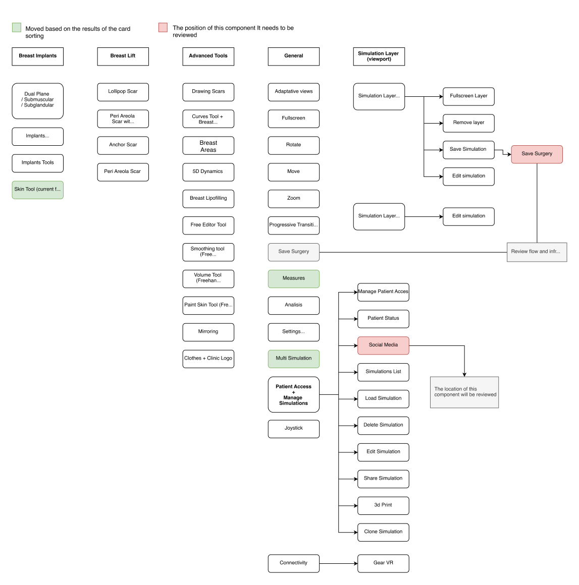
Card sorting results
Once all feedback was gathered, I drafted a catalogue of issues validated by key stakeholders. I reorganized the simulator’s functionalities, grounding my
decisions on the outcomes of remote card sorting exercises. Additionally, to establish a hierarchy among the simulator’s components, I leveraged data from
Analytics and the CRM, effectively identifying the tools that saw frequent use.
Narrowing down the scope of work
Based on the feedback from the doctors and internal stakeholders, we categorized the information into procedures to meet the doctors’ needs and thus enable them to work more efficiently.
These were the most used for breast simulation:
To help the surgeon simulate surgery in a short time we established pre-defined functionalities, taking into account surgeons’ feedback and their established practices.
This is how we refined the architecture.
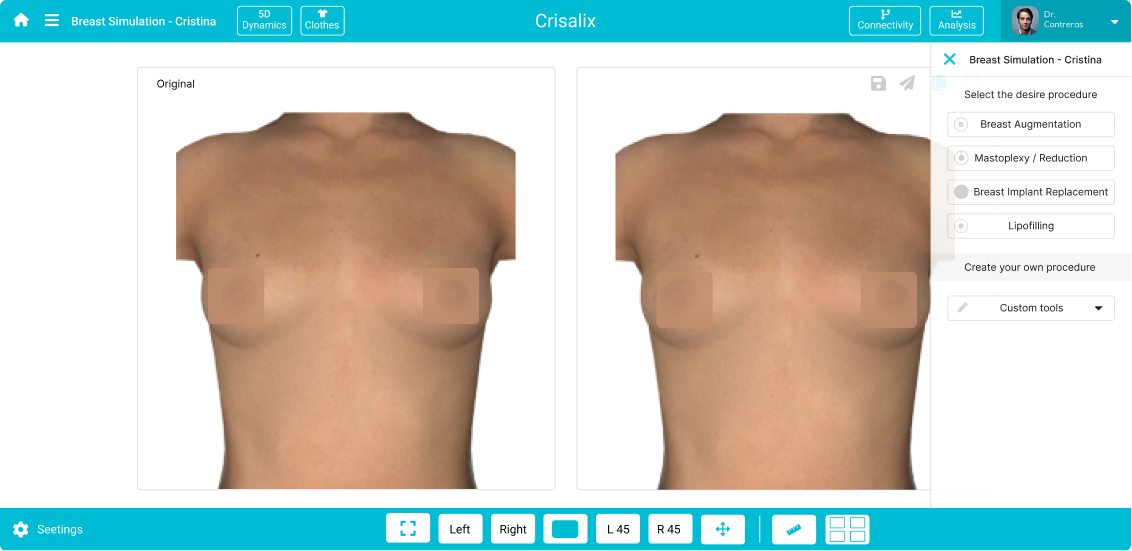
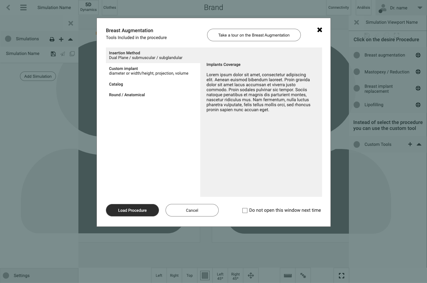
Breast augmentation
- Insert Method: Dual Plane / Submuscular / Subglandular
- Custom Implant: Diameter or width / height / Projection /
- Volume
- Catalog
- Round / Anatomical
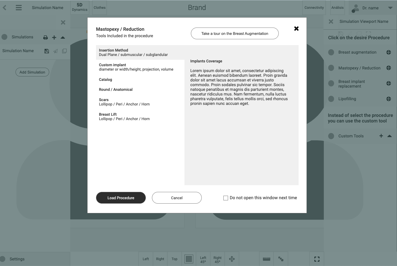
Mastopexy / Reduction
- Insert Method: Dual Plane / Submuscular / Subglandular
- Custom Implant: Diameter or width / height / Projection /
- Volume
- Catalog
- Round / Anatomical
- Scars: Lollipop / Peri / Anchor / Horn
- Breast Lift: Lollipop / Peri / Anchor / Horn
Breast Implant Replacement
- Lipofilling
- Custom tools
Result
One of the most importan usability issues was the lacked proper grouping of information. Groupings were made with functionalities that were related to each other. The card sorting, interviews with doctors, and the analysis of the main references in the world of surgery, helped to define the information design.
The functionalities were grouped into predefined views at the bottom as a sticky component.
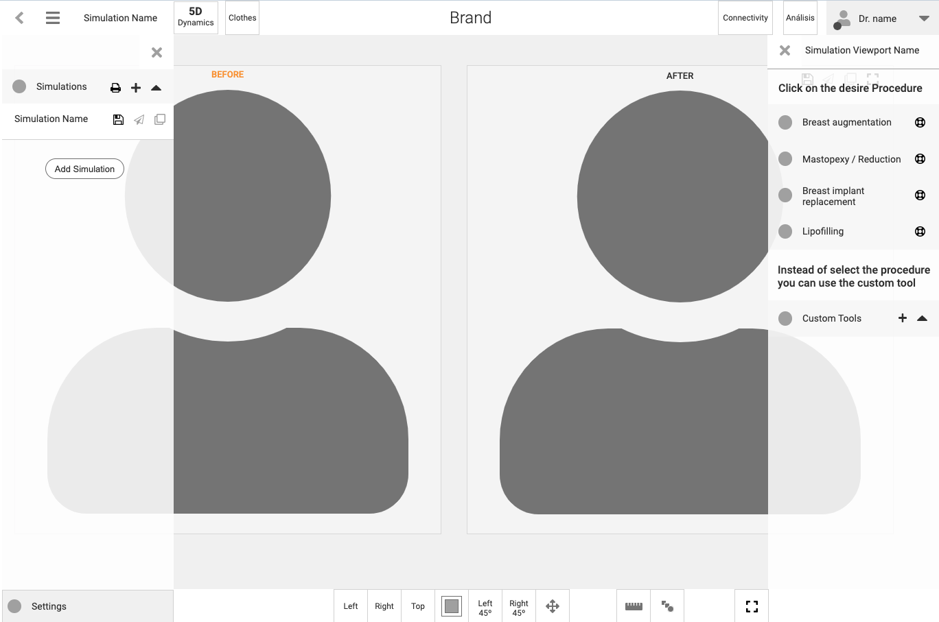
The architecture was divided into navigation on the left and right, both collapsible.
The information on the left contains access to saved simulations and features for sharing with the patient.
The information on the right is related to the grouping of the tools. In the upper bar, the doctor’s area is on the right, and the less weighted functionalities such as 5D or clothes are on the left.
Content mapping (Breast architecture sample)
Initial lo-fi ideas
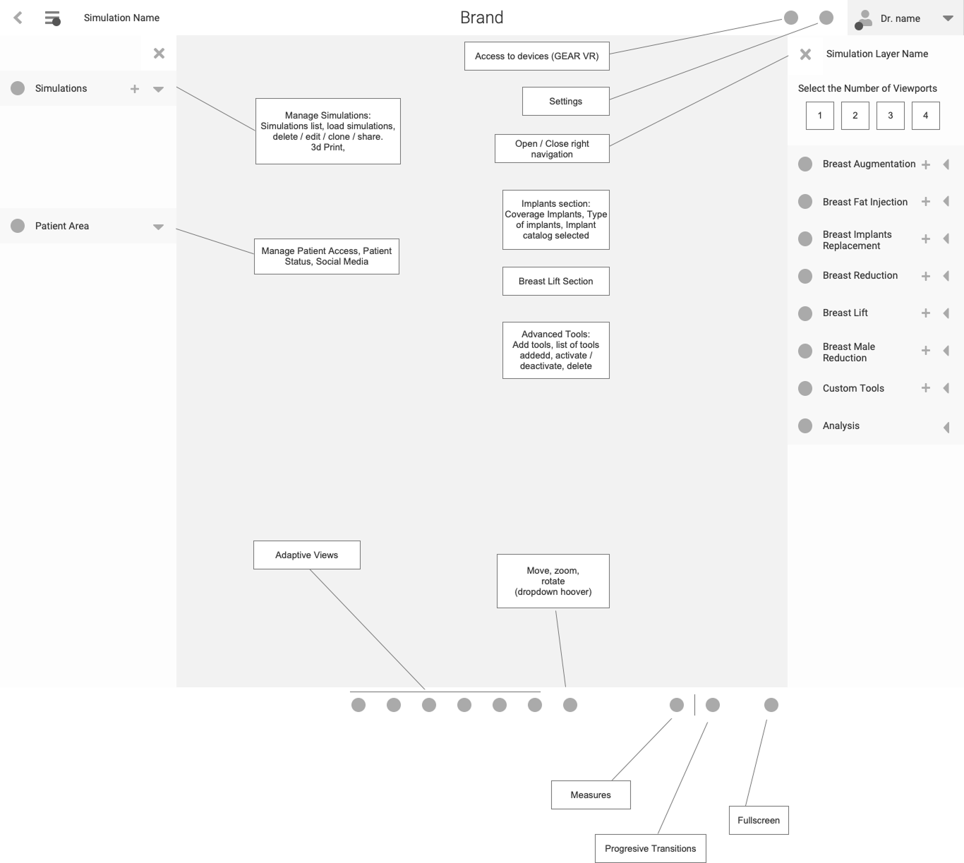
Lo-fi wireframes
A Lo-fi wireframe was created based on the research results of the previous phases.
Lection Learned
At the end of the project, the materials and procedures related to user experience were delivered to the client in an executive summary related to the investigation and the prototype functionality definition.
All the design and components created during my research and final phase were handed over to the company’s designer, who refined the components and created the design proposal based on the research gathered in the different phases and the prototypes in the phase prior to the delivery of the materials.