PUBLISHED ON — February 2026
Astra Redesign
Overview
Astra is a multimedia platform focused on streaming radio and amateur photography from an experimental perspective.
The goal of this project was to implement a visual improvement and enrich the theme.
Role
Date
Challenge Overview
Why re-design Astra?
The redesign of Astra had as its main objective to keep the user on the website for a longer time, not only for listening to the radio but also to enjoy the platform as an option for art and entertainment (understood as enjoying music and art from an alternative or experimental perspective). Currently, the radio has very few options to attract or retain users, and the sessions are very short, both in website visits and radio listening.
We rely on metrics and qualitative data that led us to redesign Astra.
New vs. Returning Users
The proportion of new users (312) is significantly higher than that of returning users (33).
This raises the need to focus on retaining current users.Retention and Customer Lifetime Value
Analyze the long-term engagement of users and adjust strategies to increase their value over time.User Interaction by Cohort
The average interaction time is approximately 4 minutes and 10 seconds. Improve interactivity and content to increase the time spent on the site.
Design Challenges
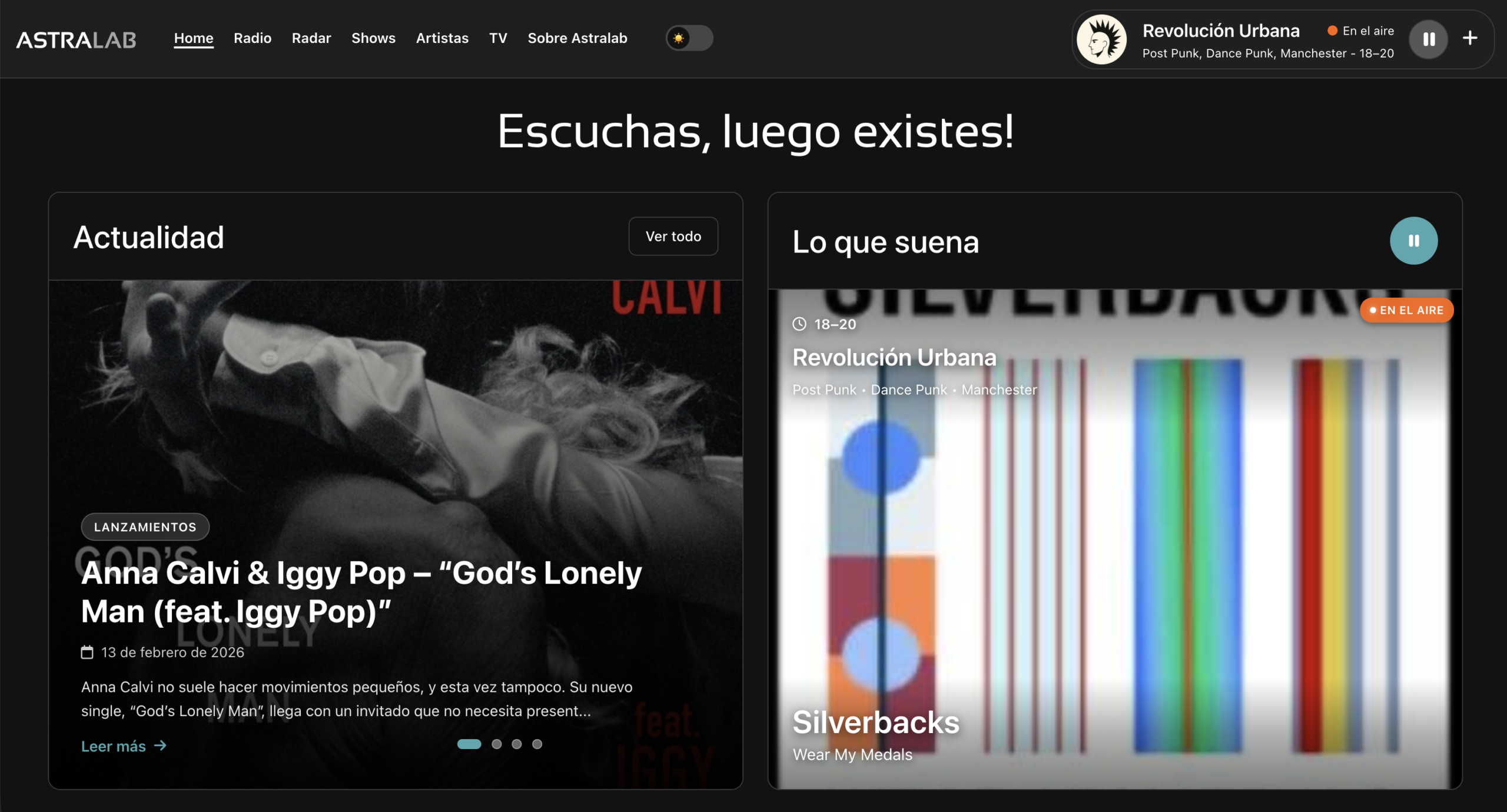
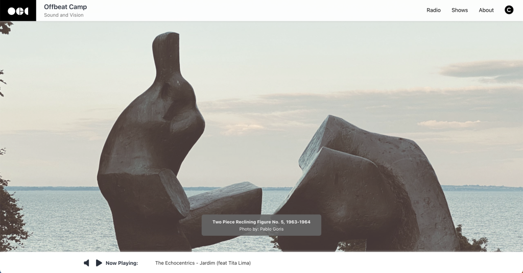
The initial design of the radio landing page was characterized by displaying large, responsive images that adapted to fill the entire browser in both width and height, accompanied by brief information about the featured work.
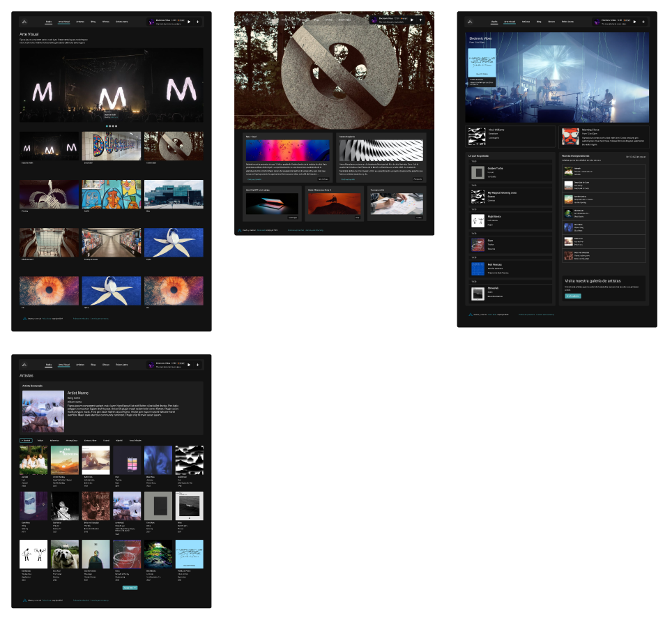
In the redesign, we have chosen to incorporate more sections to enrich the experience beyond just listening to the radio. These new areas include a blog with up-to-date news in fields such as design, technology, cinema, and photography.

Discovery & Problem Framing
Brainstorming
In the brainstorming session, the main objectives were shared, along with a summary of the metrics and qualitative data collected from feedback forms.
The main ideas were generated based on the exchange of opinions, resulting in a list of essential components that would be included in the first phase of the project.

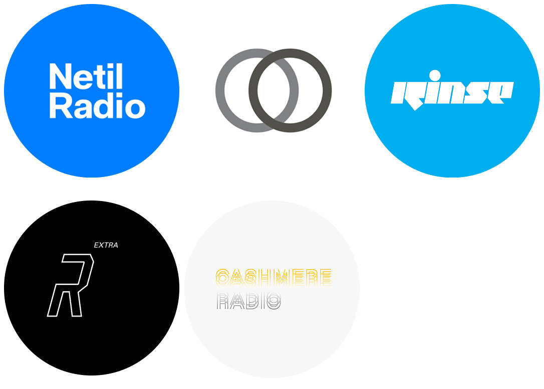
Analysis Competitor
In the analysis, competitors who are directly related to our product are included, as well as others who have a long history in the entertainment world and can contribute ideas to our redesign.
After analyzing the quantitative data, we clearly defined the points to improve, which has allowed us to refine ideas for sections or components that should be addressed.
List of radio stations:
Result
Lo-fi phase
After collecting all the data extracted from the sessions, such as sketches and comments, the final idea was worked on to deliver a low-fidelity prototype that could be iterated upon and ultimately shared with the user for validation in a task test format.
Sketches created during the brainstorming session

Initial wireframes

Hi-fi phase
The design phase started from scratch. I first worked on the logic of the variables with Figma, the base of primitive colors, also the base of numbers, paddings, margins, spaces, etc… Tokens: colors, devices, and text modes. I also used an 8 grid base for the layout foundation.
Once the logic was defined, I designed the logo for desktop and mobile, color palette, iconography, and created the necessary components. Everything was created with the Figma tool.
Dark theme