

Company
Crisalix
Redesigning a surgical simulator around clarity, hierarchy and speed
Crisalix converts 2D patient images into 3D simulations so surgeons can model aesthetic procedures and patients can better understand possible outcomes. I redesigned the simulator structure to reduce ambiguity, group related tools, prioritize the most-used functions and make the workflow easier to learn.
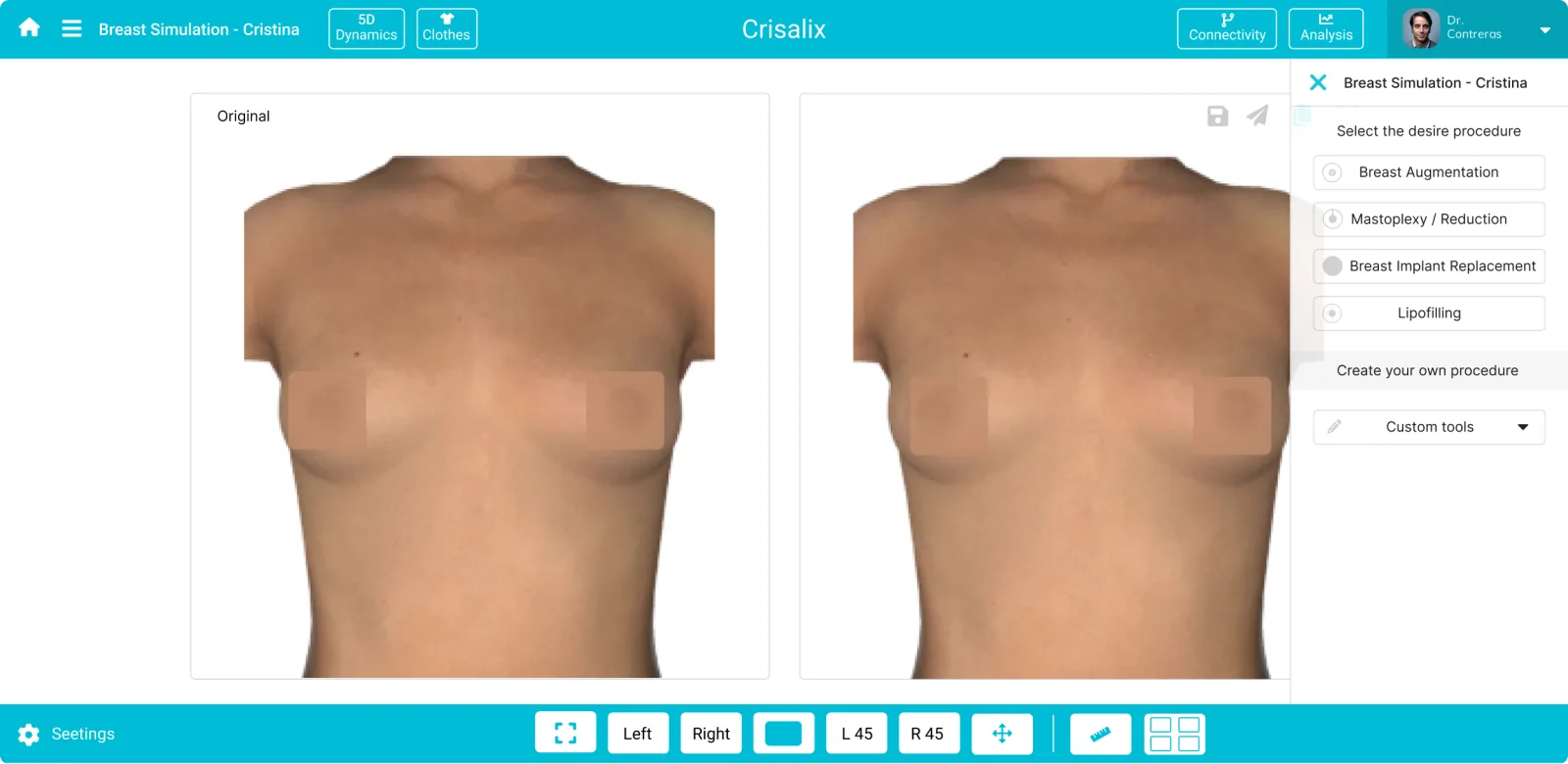
A research-led redesign for a complex clinical simulation tool
Company
Crisalix
Period
Feb – Jul 2019
Role
Research · Information architecture · Prototyping & testing
Team
Product Lead · Product Manager · Product Designer · 4 Developers
The simulator had grown around multiple tools and technical possibilities, but its information hierarchy no longer reflected how surgeons worked. The redesign focused on reorganizing the experience around procedures, making important actions easier to discover and reducing duplicated or unclear controls.
The simulator lacked hierarchy, grouping and clear interaction cues
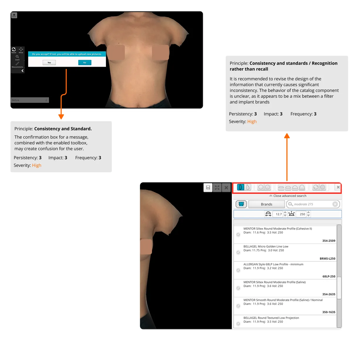
The existing interface mixed duplicated controls, unclear tool behavior and weak grouping of related functionality. Doctors could miss important tools, encounter the same control in several places or struggle to understand what happened after selecting an edit action. A heuristic review turned those observations into a concrete set of usability hypotheses.
12
high-severity usability hypotheses
2
medium-severity usability hypotheses
63.3%
of breast-simulation usage focused on predefined views
Design opportunity
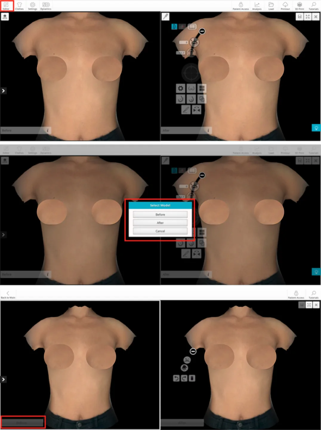
The redesign had to make a dense professional tool easier to understand without slowing expert users
Clarify hierarchy
Group the simulator around procedures and the relationships between tools.
Remove duplication
Avoid repeated controls and inconsistent entry points for the same action.
Make tools discoverable
Use clearer grouping and visual references so doctors can understand available functions.
Prioritize frequent actions
Use product data to give greater weight to the tools surgeons use most.
Preserve expert speed
Simplify orientation without turning the simulator into a slow step-by-step wizard.
Improve communication
Strengthen the environment used by doctors to manage patient simulations and sharing.
A four-phase roadmap combining research, product data, prototyping and technical alignment
The project began with a 30-day research phase because the simulator served surgeons from different countries, ages and levels of familiarity. Interviews and heuristic analysis were combined with Analytics and CRM data, followed by architecture work, low-fidelity iterations, prototype testing and regular reviews with developers.
01 · Discover
Stakeholder and surgeon interviews · Heuristic analysis · Quantitative review
02 · Define
Validate hypotheses · Card sorting · Prioritize frequently used functionality
03 · Explore
Brainstorming · Content architecture · Low-fidelity iterations
04 · Deliver
Prototype testing · Developer reviews · Accessibility check · Handoff
Working principle
Combine heuristics, interviews, card sorting and product data
To understand how the simulator should be reorganized, I combined internal knowledge with direct feedback from surgeons. A heuristic analysis surfaced usability issues, while Analytics and CRM data revealed which tools were actually used. Remote card sorting then helped validate how functionality should be grouped and prioritized.
Internal stakeholders
Sales, Customer Success and the CEO helped expose product and business constraints.
Surgeon interviews
Client interviews validated assumptions with doctors from different countries.
Heuristic analysis
The Breast simulator was reviewed using Nielsen's usability principles.
Analytics + CRM
Usage data identified high-frequency tools and helped establish visual priority.
Architecture validation
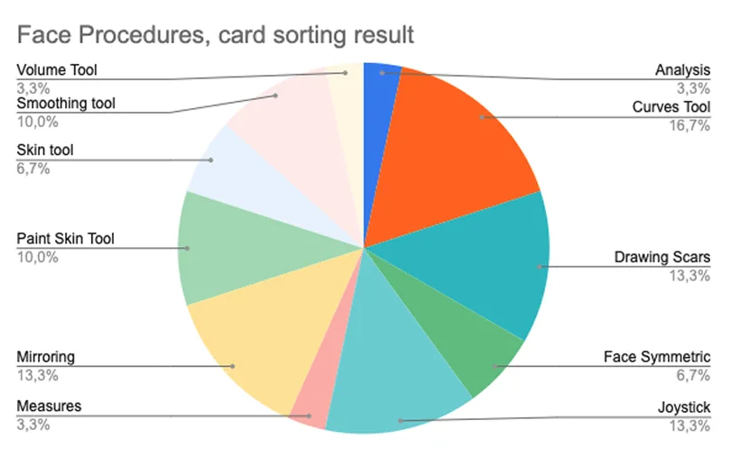
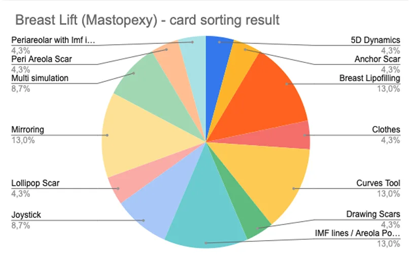
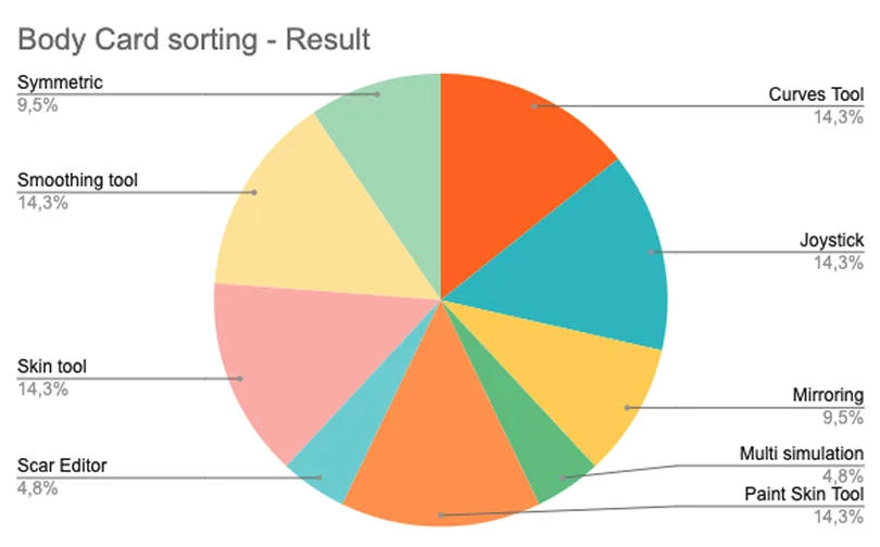
Use evidence to decide what deserves visual weight
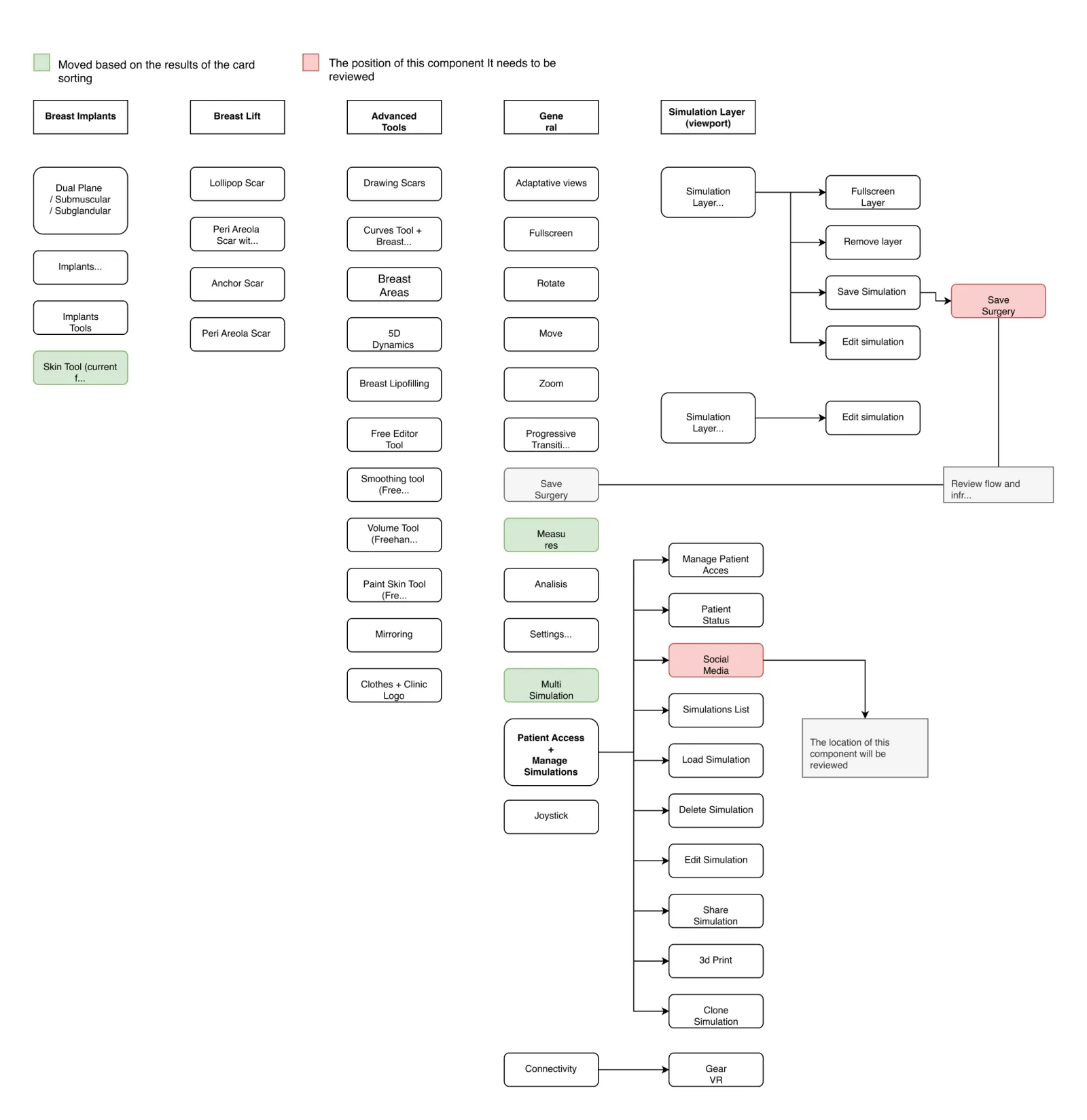
The research showed that surgeons did not need every function to compete for attention. The new information architecture grouped tools by procedure, moved high-frequency functionality into more visible positions and separated navigation, simulation tools and patient-management actions into clearer regions.
Procedure-first grouping
Functions were organized around how surgeons think about breast procedures rather than around isolated tools.
Predefined views first
The most-used functionality became a persistent, easy-to-reach part of the simulator.
Collapsible regions
Left and right navigation could collapse, reducing visual noise around the simulation area.
63.3% · Predefined Views
The dominant action in breast simulation and the strongest signal for persistent placement.
7.9% · Volume Differences
A secondary function that still needed easy access without dominating the interface.
3.5% · Advanced Tools
Lower-frequency expert functionality moved into a clearer grouped tool area.
Translate the new architecture into testable interaction patterns
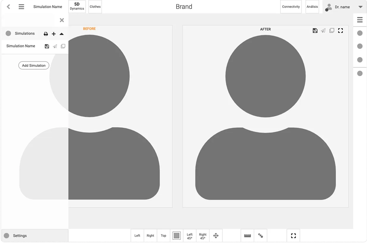
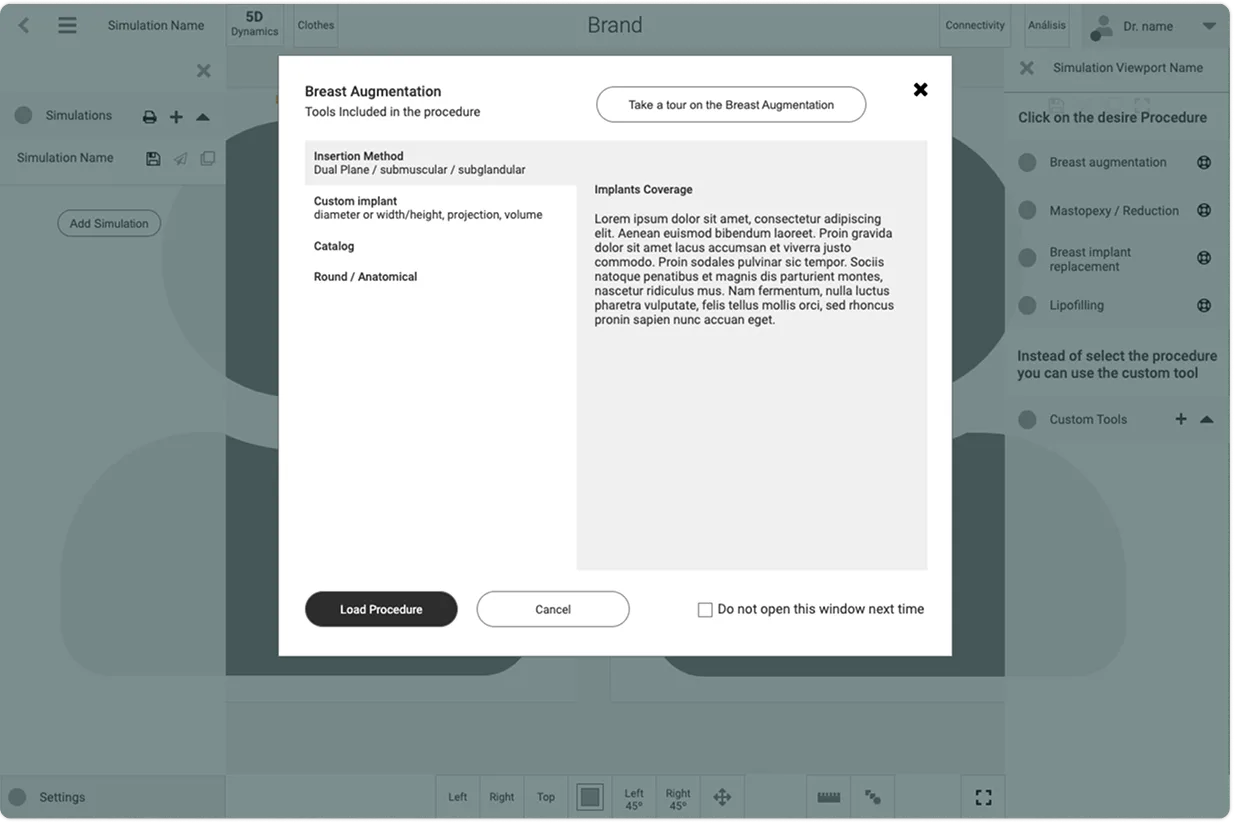
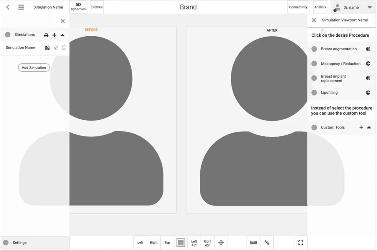
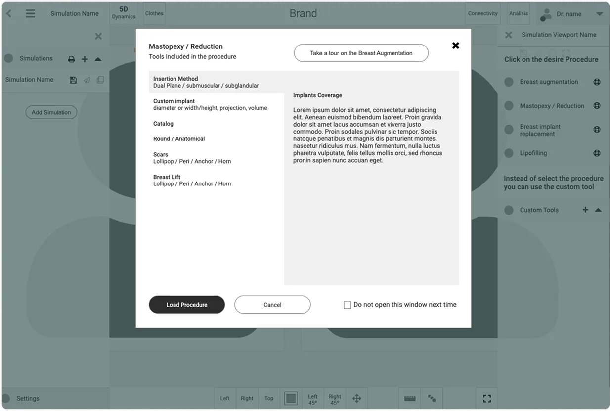
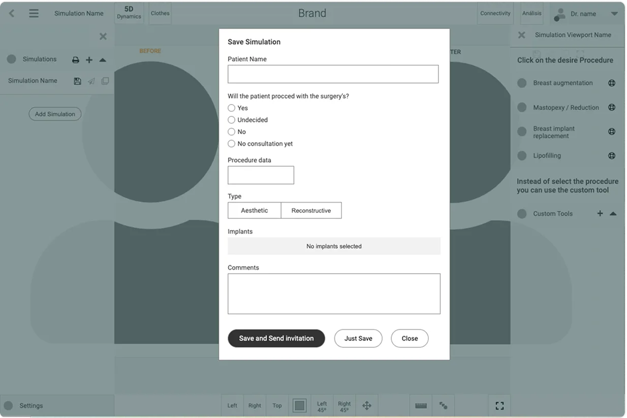
Low-fidelity prototypes were used to test the new grouping before visual refinement. The design moved predefined views into a sticky area, separated saved simulations from tool selection and gave the main simulation viewport more space. Prototype reviews and developer conversations helped refine feasibility before handoff.
Sticky predefined views
Frequent simulation views remain immediately available at the bottom of the workspace.
Left navigation
Saved simulations and patient-sharing actions are grouped away from editing tools.
Right tool grouping
Procedure-specific controls and advanced tools live in a dedicated collapsible region.
Top-bar priorities
Doctor context and lower-weight utilities are separated from the primary simulation workflow.
Deliver the research logic, prototype behavior and implementation context
The handoff focused on explaining why the new structure existed, not only what the prototype looked like. The client received an executive research summary and the prototype functionality definition, while the company designer received the design rationale and artefacts needed to continue visual refinement.
Research summary
Validated usability issues, interview findings and prioritization evidence were consolidated for the client.
Prototype functionality
The interaction model documented grouping, navigation behavior and the purpose of the main simulator regions.
Design rationale
The company designer received the research and prototype logic needed to refine components and visual design.
Handoff boundary
A clearer simulator increased adoption and reduced the learning burden
The new approach gave the product a clearer structure for both new and experienced users. Research-led grouping reduced the cognitive load of the simulator, while the simpler interaction model helped the company improve adoption, training and customer confidence.
50% ↑
adoption of the tool by new users
35% ↓
training time for users
40% ↑
customer satisfaction in surveys
20% ↑
patient referrals
Faster orientation
The simulator hierarchy gives new users a clearer starting point and reduces the need to learn the interface by trial and error.
Evidence-led prioritization
Usage data and surgeon feedback determine what is persistent, secondary or grouped as advanced functionality.
Scalable foundation
The information architecture provides a clearer base for future component and visual-system refinement.
Business connection
What this project changed in my design practice
Start with system structure
When a complex interface feels inconsistent, reorganizing the information model can create more value than polishing individual screens.
Combine qualitative + quantitative
Interviews explained why surgeons struggled; Analytics and CRM data showed which functions actually mattered most.
Handoff must explain decisions
Research rationale and prototype behavior are part of implementation context, especially when another designer continues the visual work.
Key takeaway