

Company
Astra
Keeping people on the site, not just on the stream.
Astra is a multimedia platform built around streaming radio and amateur photography from an experimental perspective. The site did one thing well and nothing else: you arrived, you listened, you left. The redesign set out to give it reasons to stay, without turning an independent radio into a portal.
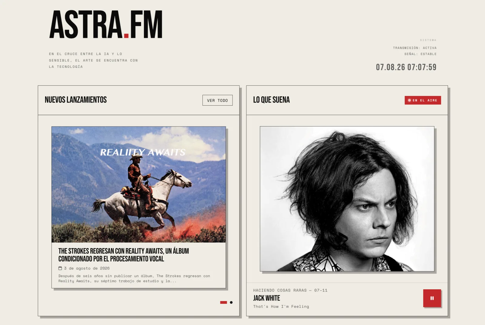
Sessions were short and almost nobody came back. The problem was not the stream, it was everything the site did not offer.
Company
Astra
Role
Researcher, information architecture, visual design, prototyping and testing
Date
September 2024
Scope
Research, IA, design system foundations and the redesigned site
The redesign had one objective: keep people on the site longer, not only to listen to the radio but to use the platform as somewhere to spend time with music and art from an alternative perspective. As it stood, the radio had very little to attract or retain anyone, and the sessions showed it, both in visits and in listening time. Metrics and qualitative data made the case for rebuilding it.
What this case reports
Almost everyone arriving was new, and almost nobody stayed four minutes.
312
new users against 33 returning: the audience renewed itself instead of coming back
33
returning users, which is what made retention the problem to solve
4m 10s
average interaction time per session across cohorts
Three readings pointed the same way. The proportion of new to returning users was so lopsided that growth was not the issue; retention was. Cohort analysis showed the long-term engagement was thin enough that it had to be built rather than optimised. And an average session of just over four minutes said the site gave people nothing to do once the stream was playing.
The conclusion that set the scope
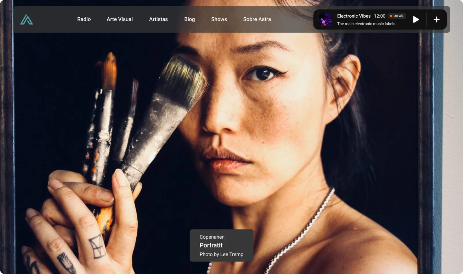
A full-bleed image, the name of the track, and the player. Beautiful, and with nowhere to go.
The original landing page was built around large responsive images that filled the browser in both directions, with a short note about the featured work. It read as a statement rather than a site: everything the visitor could do was on that first screen, and it was to press play.
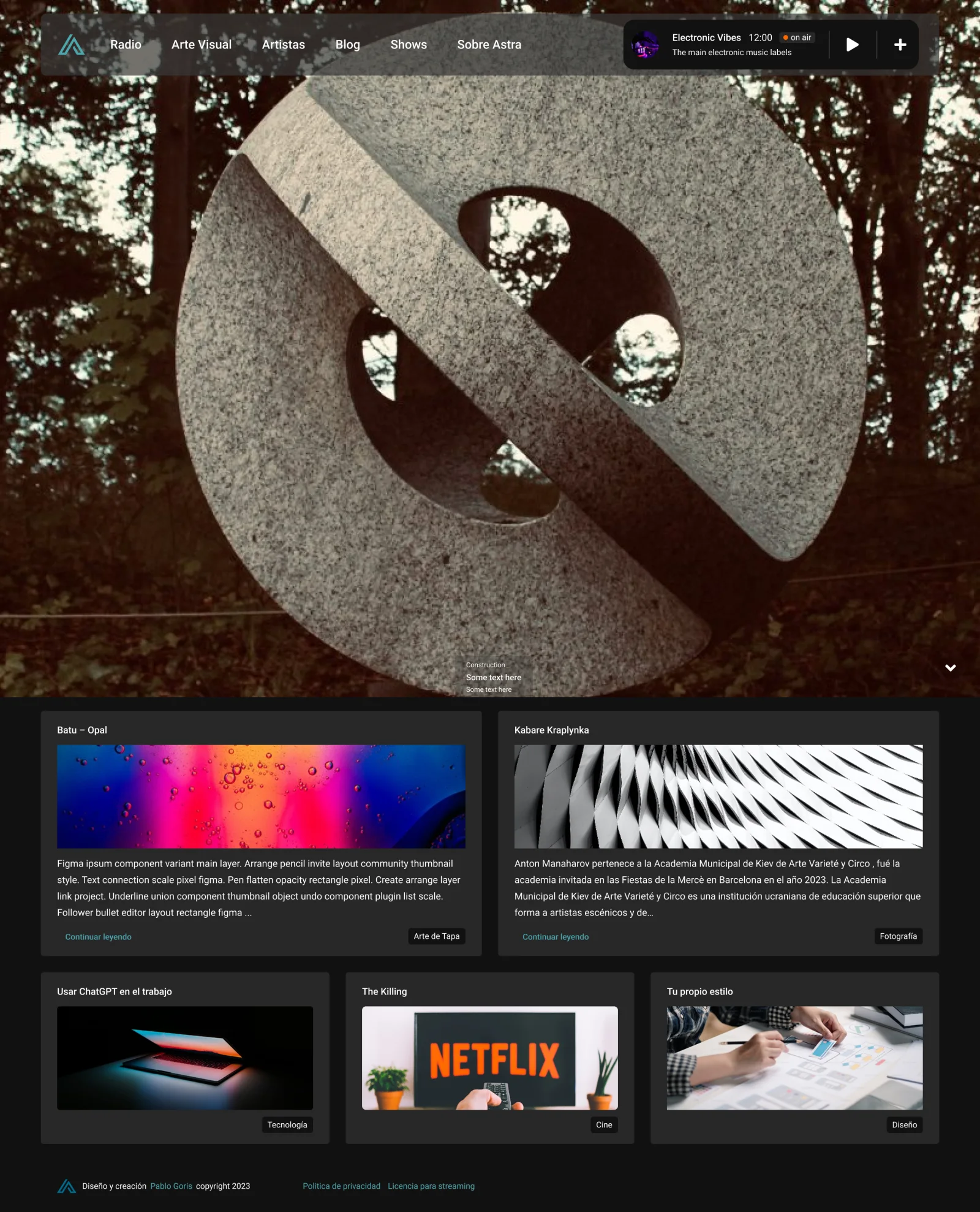
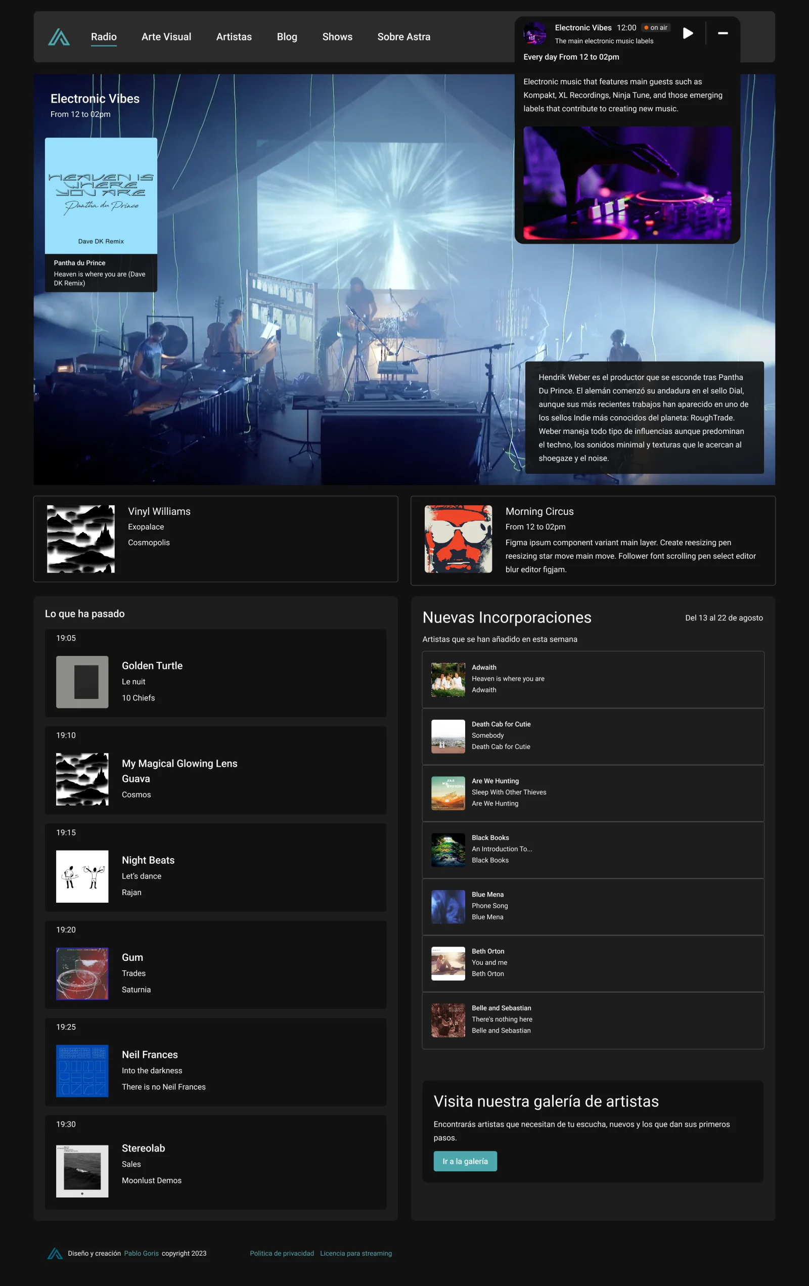

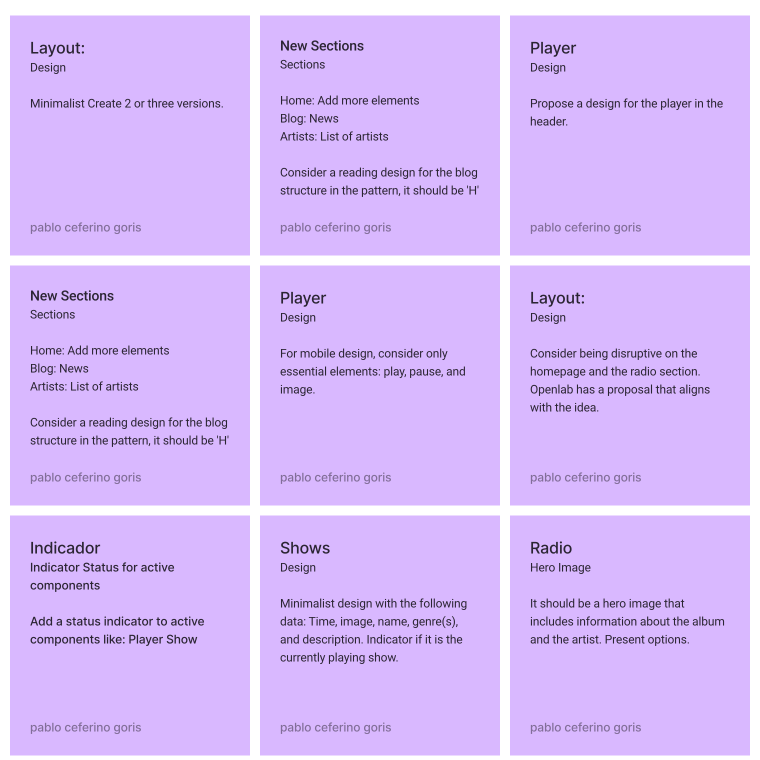
A brainstorming session turned the data into components, and a competitor review told us which of them were worth building.
The session started from the objectives and a summary of the metrics and the qualitative data from the feedback forms. Ideas came out of the exchange rather than from a brief, and what came out of it was a list of the components that had to exist in the first phase.
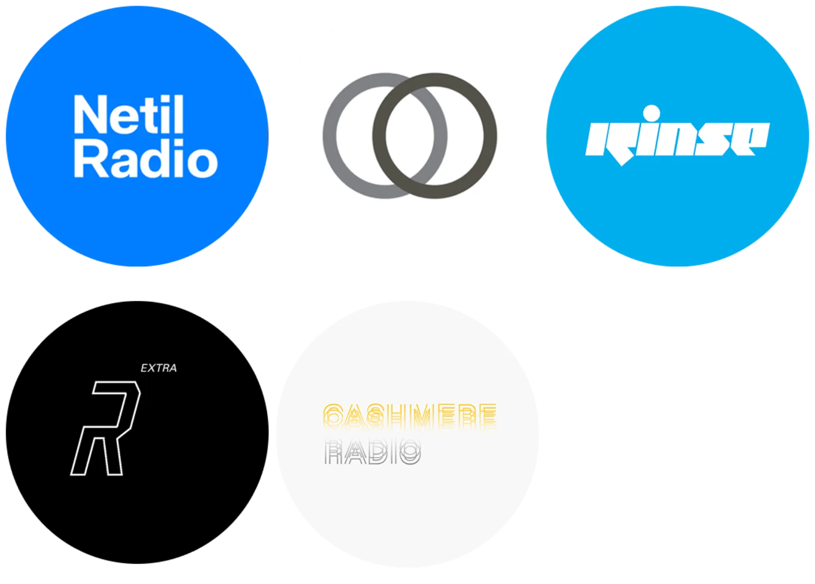
The review covered products directly comparable to Astra and others with a long history in entertainment that could contribute ideas. Reading it against the quantitative data made the points to improve concrete, which is what allowed the redesign to be scoped instead of debated.
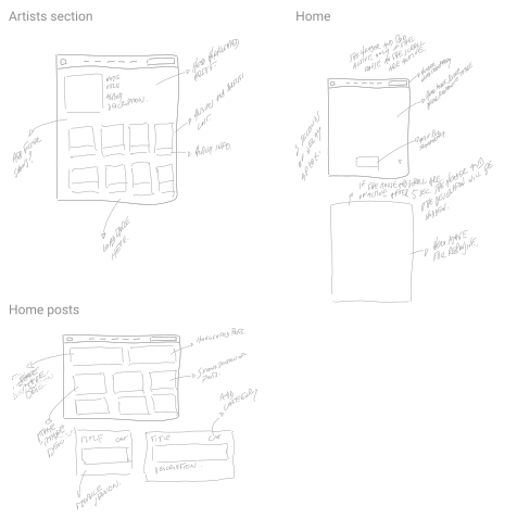
Sketches from the session became a prototype that could be iterated and put in front of a user as a task test.
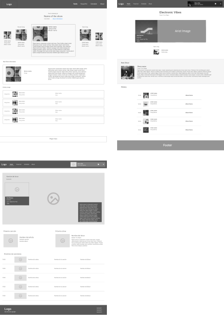
With the sketches and the comments from the sessions collected, the idea was worked into a low-fidelity prototype: something that could be changed cheaply and, above all, shared with a user for validation in a task test format before anything looked finished.
Primitives, spacing, tokens and an 8pt grid came first. The logo, the palette and the iconography came after.
The design phase started from scratch and, deliberately, from the logic: the primitive colours, the numeric base, the paddings, margins and spacing, and the tokens for colour, devices and text modes, on an 8pt grid. Only once that was defined did the visible layer follow: the logo for desktop and mobile, the colour palette, the iconography and the components the redesign needed.
Primitives and tokens
Colour, devices and text modes defined as variables in Figma before any screen existed.
An 8pt base
Paddings, margins and spacing resolved on one grid, so the layout has a single source of measurement.
Brand and iconography
A logo for desktop and mobile, the palette and the icon set, built on top of the variables rather than beside them.
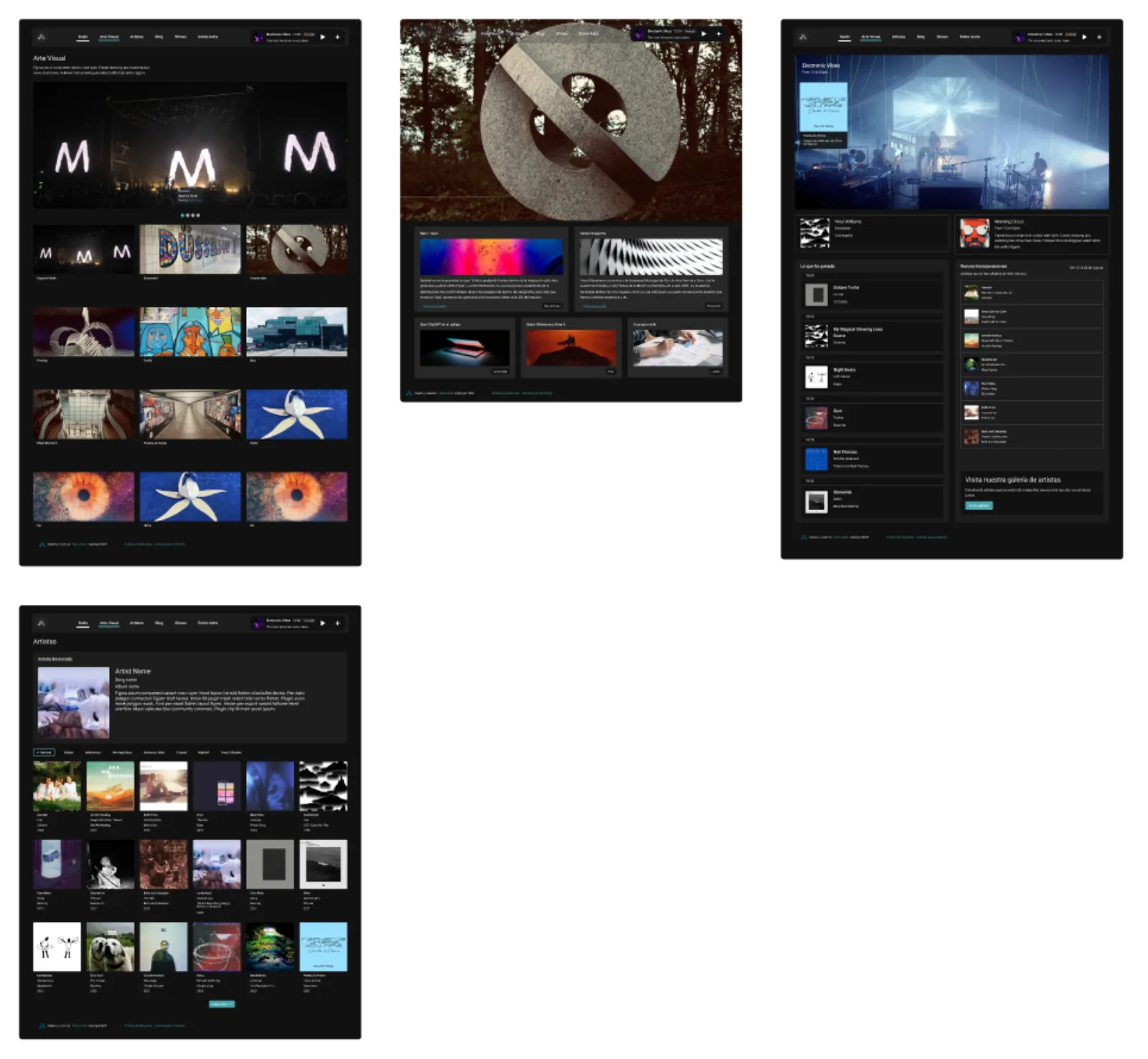
Reported as what was delivered: the structure, the system and the decisions behind them.
A site with somewhere to go
Editorial, visual work, shows and releases give a visit a purpose beyond the four minutes the stream held.
A token base, not a style
Colour, spacing and text modes were defined as variables, so the visual layer can change without redrawing the site.
Validated before it was pretty
The task test ran on the low-fidelity prototype, which is where changing something still costs nothing.
A brand that fits its container
The mark was redrawn for desktop and mobile as part of the system rather than dropped in at the end.
What I would measure next